Automotive Marketers can Create a Frictionless Experience for Conversion //
The key to maximizing ROI for automotive marketing campaigns is creating a frictionless experience on your landing pages. You want to guide your customers seamlessly through the sales funnel from the moment they click on your ad until the conversion. What tactics can you use to get better results?
We have taken some key lessons from Driveway’s approach to help you optimize landing pages and increase your ROAS. These tactics can help you increase conversions in your automotive campaigns and provide a better user experience.
Why you should include these elements in your landing pages!
Answer Visitors’ Most Important Questions
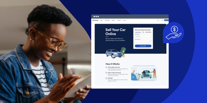
Visitors to your landing page are likely to ask questions immediately, especially if you’re in the automotive sector. The most frequent question for Driveway is: What’s the process of buying and selling? Visitors may be reluctant or distrustful about buying and selling cars online. You can engage your visitors and answer their most pressing questions by including a FAQ section either in the hero section, or below the fold. This will keep them engaged and educated without them having to leave the page and interrupting the conversion process.
Leverage Authority Logos
Visitors to your offer pages may be reluctant or uncertain about making an automotive decision online. You can use well-known partners or accreditations to build their trust. Driveway achieves this through a section that shares the logos of CarFax and Kelley Blue Book. Driveway uses these logos in order to give the customer more confidence.
Include a Sticky CTA Button
Your landing page may need a lot of content in order to convince an automotive customer to take the next digital step or convert. This detailed information will increase the depth of your landing pages, meaning that by the time users reach the bottom of the page, they may forget the CTA button. Driveway uses a “sticky CTA” offer that follows the user throughout the entire page to avoid this and maximize conversions. The button for conversion is only a click away whenever the user is ready to move on to the next stage of the conversion process.
What would we experiment with?
Instapage believes that testing and experimentation are necessary to get the best conversion rates on landing pages. Here are some of the elements we’d test on the Driveway page.
- A/B-test the images: Driveway leverages their brand by including an illustration of a vehicle and cash in the hero section. This is a well-designed, appealing image. However, it does not show what users can expect from the platform. Instead, we would suggest A/B-testing the illustrated image section with an image from their platform UI to build trust and to give potential customers a sneak peak at what they can expect.
- Reduce navigation menu: In an earlier blog post, we said that the sticky CTA in the navigation bar is one of our favorites. The way the navigation menu is structured currently in the Hero section allows visitors to explore other areas of the website and click away from the landing page, potentially driving them away from your conversion goal. We recommend simplifying the navigation and limiting the CTA to the sticky CTA. This will allow visitors to easily click away from the landing page.
You can improve your automotive landing pages by incorporating the key lessons we’ve learned from Driveway’s landing page strategy.
Sign up for a 14-day Instapage trial to see how powerful a landing page platform is. Here is the complete Driveway landing pages review .